

Art In The Workplace
Why Environmental Graphic Design Still Needs a Human in the Room
Friday, August 28, 2026


.svg)
AI image generators can produce a beautiful rendering in seconds. Sometimes, that is the problem: a single image is not a design. Environmental graphic design has to survive contact with typography, fabrication, code, and the way people actually move through a building, and each of those is a place a generated picture quietly falls apart.
AI Image Generators Still Cannot Reliably Render Text
Most environmental graphics exist to communicate something specific: a room name, a directional arrow, an exit route, or a donor's name. Legible, accurate typography is not a nice-to-have. It is the entire point.
Text generation remains one of the most persistent weaknesses of image models. Ask an AI generator for a sign reading "OPENING SOON" and you are just as likely to get something like "OPAN SOO." Adobe's own support forums are full of users reporting the same failure mode across tools: misspelled words, duplicated letters, and invented characters that resemble language but are not actually language. The underlying reason is structural. These models treat letterforms as visual shapes to approximate, not as symbols with fixed, correct spellings, so there is no mechanism forcing the output to actually say what it is supposed to say. Even Adobe's own guidance for its Firefly tool is to generate a blank sign and then add real text by hand in Photoshop.
For a birthday card, that is a funny glitch. For a hospital wayfinding sign or an emergency exit graphic, it is a liability.
A Generated Image Is Not a Buildable System
An AI tool can output a striking concept render. It cannot produce a file that a fabricator can use to build from, and it cannot account for the dozens of other touchpoints that the render must match. Research on AI-generated design points to a real technical ceiling: current models are good at producing a picture of a finished idea, but they lack the fine-grained control, precise dimensions, layered elements, material callouts, and mounting details that turn a concept into a constructable object. That same limitation shows up at the brand level. A directory, a donor wall, a corridor of wayfinding signs, and a lobby installation all need to feel like they came from the same hand, using consistent color, type, iconography, and hierarchy. Generative models treat every image as an isolated task, with no built-in way to carry a visual system across formats. A human designer holds the whole system and the buildable spec behind it in their head. An AI tool, by design, does neither.
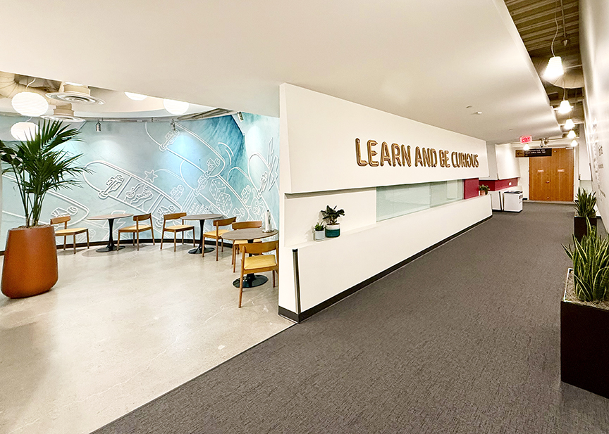
Accessibility Compliance Is a Legal Standard, Not a Style Choice
ADA signage requirements are specific and largely non-negotiable: tactile character height, Braille placement, contrast ratios, mounting height, and terminology that matches a building's directories exactly. An AI image generator cannot know a local code overlay, guarantee contrast ratios meet spec, or catch that the room name on a sign does not match the one in the directory two floors down. That kind of mismatch is, according to accessibility guidance, one of the most common ways wayfinding systems break down in practice.
Code compliance also does not guarantee usability. Research on hospital wayfinding has found that systems relying on signage alone do not adequately serve users with a wide range of physical and cognitive impairments, a gap that matters more every year as aging and disabled populations grow as a share of the people navigating these spaces. Designing for that range of needs takes understanding how real people with real limitations move through and read a space, not generating an image that happens to look compliant.
Space Is Experienced, Not Rendered
Good wayfinding design is built around identifiable decision points: intersections, elevator lobbies, corridor splits, and any location where a visitor has to choose which way to go. When those points are designed well, a visitor moves through them without slowing down. When they are not, a visitor stops, scans the surroundings, and hesitates; that hesitation signals a failure of the graphics, signage, and architecture to work together.
Catching that failure requires standing in the actual space: walking the corridor at a real visitor's pace, noticing where a graphic reads clearly from thirty feet but disappears at three, and watching how afternoon light changes the contrast on a wall the mockup never accounted for. Researchers have paired VR immersion with EEG sensors to measure how color, graphics, and architecture impact navigation, as poor wayfinding increases anxiety and wastes staff time. An AI generator can produce a plausible-looking picture of a lobby from one angle. It cannot stand at the elevator lobby and notice a visitor hesitate. Only a person can catch that, and only a person can go back and fix it.
What You're Actually Hiring a Designer For
AI can speed up early sketching, but only when a person is directing it and catching what it misses. Left on its own, it produces a wall-sized image with the wrong spelling on it, a sign that does not match code, or a graphic no one thought to test against the way people actually move through the building.
What you are hiring a designer for is everything past that first pretty picture: typography that says what it is supposed to say, a system that holds together across every touchpoint in the space, signage that meets code and actually serves the people using it, and a design that has been tested against the real building rather than a single rendered angle. Get any of that wrong, and it is not a style problem; it is a callback, a change order, or a compliance issue with your name on the project. Get it right, and the space works as intended when it first opens its doors.

More Posts
Related Articles

Harnessing Color Psychology in Healthcare Art
Learn how strategic color choices can transform clinical spaces into havens of comfort and support.

Exploring the Benefits of Corporate Art Consulting
Using art to create a professional workplace and enhance office layout for a positive and inspiring environment.
The Intricate Allure of Texture in Abstract Art
The transformative power of texture in our online exhibition, featuring the abstract works of Father Bill Moore.
About Us
TKOart is a full-service art consultancy with over 30 years of experience, dedicated to bringing your fine art needs to life.