


.svg)
Companies are in an expensive fight to get people back to the office. Amazon, JP Morgan, and a growing list of major employers have moved to full five-day mandates. Countless others are tightening hybrid policies. And yet a Gensler survey from 2025 found that employees globally spend about 55% of their week in the office but say they need to be there closer to 65% to perform at their best. Something is holding them back, and according to the same research, it's usually the quality of the space itself.
This is the real context behind the resimercial design trend, and it raises the stakes considerably. Resimercial offices aren't just an aesthetic choice. For companies making a serious push to bring people back, the physical environment is now a business argument. An office that doesn't make the commute feel worthwhile is a retention liability. SHRM data puts the cost of replacing an employee at between 50% and 200% of their annual salary. That number has a way of clarifying the ROI conversation around workplace investment.
What Resimercial Gets Right, and Where It Falls Short
Resimercial design blends the comfort and personality of a home with the function of a workplace. Plush seating, warm materials, layered lighting, kitchen areas designed for gathering rather than just eating: the goal is an office that competes with the comfort employees have grown accustomed to at home.
That instinct is correct. What's less understood is that comfort alone doesn't create the feeling people are actually responding to when a space works. A good sectional and warm lighting make a room comfortable. They don't make it feel like it belongs to anyone. That last part is what drives the deeper sense of connection, pride, and investment that actually moves retention numbers. And it's the part that most resimercial offices get wrong, because it's the part they leave to art, and then treat art as an afterthought.
The Art Problem
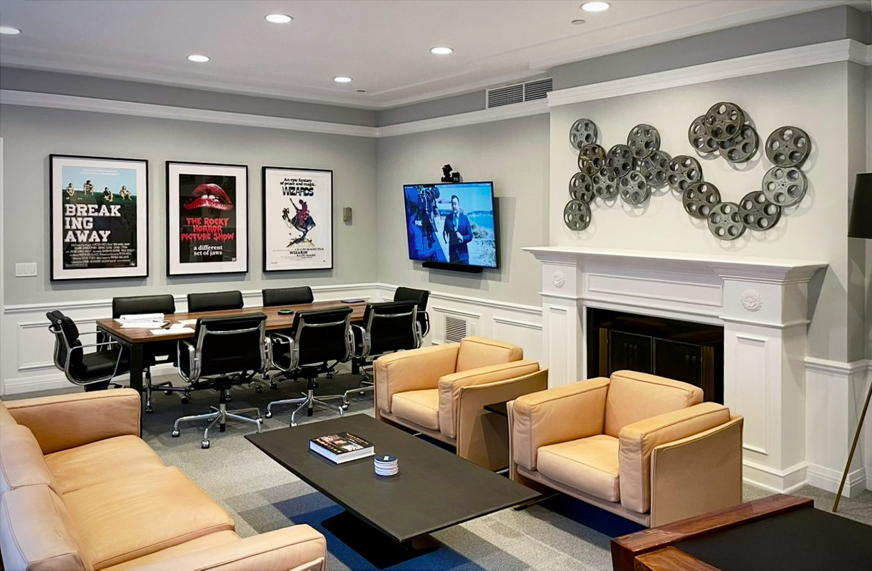
Every design firm pitching a resimercial office right now will show you the same renderings: the sectional, the wood paneling, the kitchen island, and a wall of art that was clearly chosen last, after every other decision was already locked. Most resimercial offices treat art as the final layer of warmth, bought to soften a space that was designed without it in mind.
The result is offices that check every box on paper and still feel hollow the moment you walk in. If you've ever stood in a beautifully furnished office and felt strangely unmoved by it, this is usually why.
Art chosen primarily to not offend anyone ends up forgettable, no matter how well it looks in a rendering. A few specific reasons it fails:
It has no relationship to the room. Generic art is sized and placed for "a wall," not for the specific sightlines, traffic patterns, and sense of arrival in that particular space. The same piece could hang in any office in the country and nobody would notice it had moved.
It has no relationship to the company. Art with no connection to the organization's history, values, location, or people signals nothing. Employees walk past it the same way they walk past a fire extinguisher.
It's chosen to avoid offense, not to create impact. When the brief is "something calming and inoffensive," the result is art with the emotional range removed. Safe art doesn't make anyone feel unwelcome, but it also doesn't make anyone feel anything at all.
The Fix Is Sequencing, Not Spending
The instinct when an office feels flat is to add more art, or more expensive art. That's rarely the actual fix. The real issue is almost always when the art was brought into the process.
Bring art into the conversation at the same time as architecture and floor plan, not after. A piece chosen to anchor a double-height lobby has different scale, color, and material requirements than a piece chosen for a narrow hallway. If the art is selected after the architecture is finalized, it's reacting to decisions it should have informed. Ask your design team when art enters the project timeline. If the answer is "near the end," that's worth revisiting.
Let each zone's function set the criteria for its art, before you look at a single piece. A high-energy collaboration space and a quiet focus room are not the same design problem, and they shouldn't get the same kind of art. Decide what each space needs to do for the people in it first. Then go looking for work that does that job, rather than picking pieces you like and assigning them to rooms afterward.
Choose specificity over safety. Local artists, regionally relevant subject matter, materials connected to the industry or history of the company: these create a sense that the space belongs to this organization specifically, in this place, at this time. That specificity is what a piece chosen off a generic shortlist can never deliver, no matter how well it matches the throw pillows.
Use scale and placement deliberately. A piece that's technically the right size for a wall is not the same as a piece placed to be seen from the right angle, at the right distance, by someone walking toward it rather than past it. Placement is a design decision, not a logistics problem to solve after the art arrives.
Treat the Art Program as a Design Input, Not a Budget Line Item
If you're scoping a resimercial redesign, the practical takeaway is to involve an art consultant at the same stage you involve your architect and interior designer. Give the art program its own brief and its own seat at the table from the beginning, so it's informing the space rather than reacting to it.
This doesn't necessarily mean spending more. It means spending earlier and more deliberately, so the art and the architecture are solving the same problem together. The companies that get this right end up with offices that don't just look the part. They feel like somewhere worth showing up to.
TKOart specializes in corporate art consulting, collection curation, artist commissions, and installation management for companies making a serious investment in their workplace. Get in touch →

More Posts
Related Articles

Harnessing Color Psychology in Healthcare Art
Learn how strategic color choices can transform clinical spaces into havens of comfort and support.

Exploring the Benefits of Corporate Art Consulting
Using art to create a professional workplace and enhance office layout for a positive and inspiring environment.
The Intricate Allure of Texture in Abstract Art
The transformative power of texture in our online exhibition, featuring the abstract works of Father Bill Moore.
About Us
TKOart is a full-service art consultancy with over 30 years of experience, dedicated to bringing your fine art needs to life.